Wednesday, 19 May 2010

End of Year Show proposals...


This is the proposal/mockup of what I tend to go ahead with for my end of year show, I am pleased with a lot of the work that I have created over 3rd year so it was hard for me to pin point a certain brief that I have done that will really show me off as the designer that I am and really give people an insight into the sort of work that I do and what I specialise in. I want my boards to really catch peoples attention so I thought I would use my ABC Dimensional posters that have a strong focus on experimental/creative type.
It was mentioned in the crit that I should also definitely have my portfolio there so that people can see all the other stuff that I do and that it is not just all about food experimentation!!!

More development of logo...

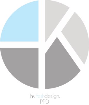
I have established the position of type within circle for my logo now, now all I have to consider is the colour that I am going to use. I think the greyscale variations are going to work alot better and will be more versatile.


Above: different layouts that I could go with, I am like the 1st and 3rd logos at the moment.
I have gone back and looked in to my logo again....I still thought there was something i wasn't happy about, it only needs refining ever so slightly so I have adjusted it to make the type less obvious and I wanted to put more emphasis on the 'k'.

Tuesday, 18 May 2010

This is a quick little experiment that I created in illustrator using my logo within the context of other objects.

Friday, 14 May 2010

Final Business Card

This is the final layout and design for my new business card that I will be giving out to poeple from now on.

More logo development...

Below: After design my new logo I have updated my portfolio and changed the layout of information adding my new logo into this. I am really pleased with this, it just makes my portfolio more personal and individual to me now.


Placing logo onto business card, I thought that with my logo i would maybe have to add some information to the bottom of the card for instance 'fresh design' or 'hkfreshdesign' just so that it is emphasising my identity and website.
Below: Two different experiments, playing around with logo eliminating elements to see if it is still legible and maybe if it would then look more unique to me. I am pleased with the first experiement but I still think I am going to keep my original design and keep it simple.

Below: Different compositions and variations of how i could have my business card, I quite like the involvement of adding another circle to the logo.

Below: Experimenting with identity and logo design. Changing kerning, leading and transparency of the type.


Thursday, 6 May 2010

Type Experiment..


I decided to have a little play around with type to maybe come to a decision for what to put on to my business card!
This isn't a final outcome but it is an interesting start.I want my business card to communicate that I am a typographer and illustrator and I want the front of my business card to portray this.